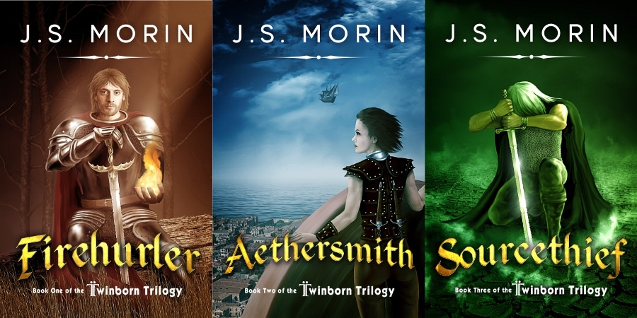
It’s 2014 now, and to go along with the change in calendar, I’ve updated the covers for the Twinborn Trilogy. With the success of the series, I thought it was time to reinvest in better cover layouts. I’ve always loved Duncan Long’s artwork for the series, but it was time to go outside for the cover design. I couldn’t be happier with the results!
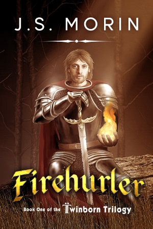
Firehurler
Firehurler’s updated cover casts a red hue that gives the series its Red/Blue/Green color scheme when lined up together. The new font for the title and my name name both stand out better and are easier to read against the background. I also appreciate the arch to the lettering. I always liked my original covers, but I knew they needed a tune-up. Once I saw these, my reservations melted away.
On a side note, I always thought those little swooshy things (like I now have under my author name) looked like dual lightsabers. I’m pretty sure you’ll be able to make the book make lightsaber wooooom woooom sounds by swinging around a paperback or ebook version.
(legal disclaimer: they probably won’t)
Aethersmith
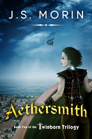
For Aethersmith, darkening the image really made the sky vivid and sets off the gold in the lettering. While Firehurler might look the most different, I think Aethersmith’s was the biggest improvement. That little shift in the color really made a drastic change to the feel.
Sourcethief
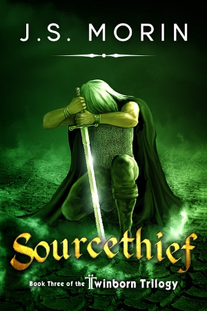
What can I say? Aside from the font changes, Sourcethief stayed largely unchanged. It was the best of the bunch to start with, and I’d like to think that it was the model for the updates to Firehurler and Aethersmith as far as color and contrast. I never would have guessed when I was writing the series that the Battle of the Dead Earth would end up being the image that best showed off the series. It’s also the only one of the three that shows as actual scene as it takes place in the text. Firehurler was always a mash-up of Brannis and Kyrus, just as Aethersmith was a mash-up of Juliana and Soria.
War-Bringer
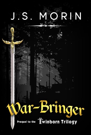
War-Bringer just needed a bit of a tweak to fall in line with the main trilogy. It got the updated fonts, and the sword moved a bit to make room for the larger lettering up top. It always had a stark look (harsh black and white, not related to dire wolves) before, but the gold lettering stand out well against the monochrome background.
I think the sword stabbing through the “W” looks pretty cool, too.
The New Look
What do you think? Are these new cover layouts what will rocket the Twinborn Trilogy up the bestseller lists? Should I start practicing my movie deal handshake? (or do Hollywood producers shake hands like everyone else?)

0 Comments